Thank you all for the kind responses to last week’s letter, I’m so glad you enjoyed the story.
This week, a process letter with lots of pictures.
A few weeks ago I told you the origin of the story (#92), so I’ll skip right to making the comic proper, which started with layout sketches.
Layout
Some big sheets of A3 newsprint paper I bought in lockdown really came into their own for this. I could draw big and try multiple layouts side-by-side.
I began with these very rough sketches in thick pencil. The contest required the entries be a specific size and dimension, and with lots of information to convey, I realised each page would need four rows of panels.
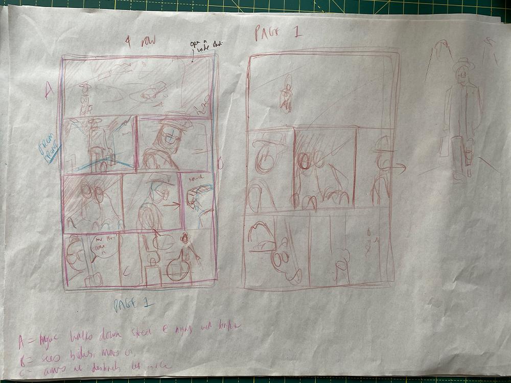
Rough layout sketch for page 1, testing four-row and three-row layouts
This is a really fascinating stage in the process because it’s where you really figure out the visual beats of your story. What information do you reveal first and what do you hold off?
Some panels, like the establishing shots (which introduce new locations) require almost the full width of the page. They also slow time down, like a pause, whereas a row of three tight panels creates the sense of action happening very quickly or all at once.
Panel design creates rhythm!
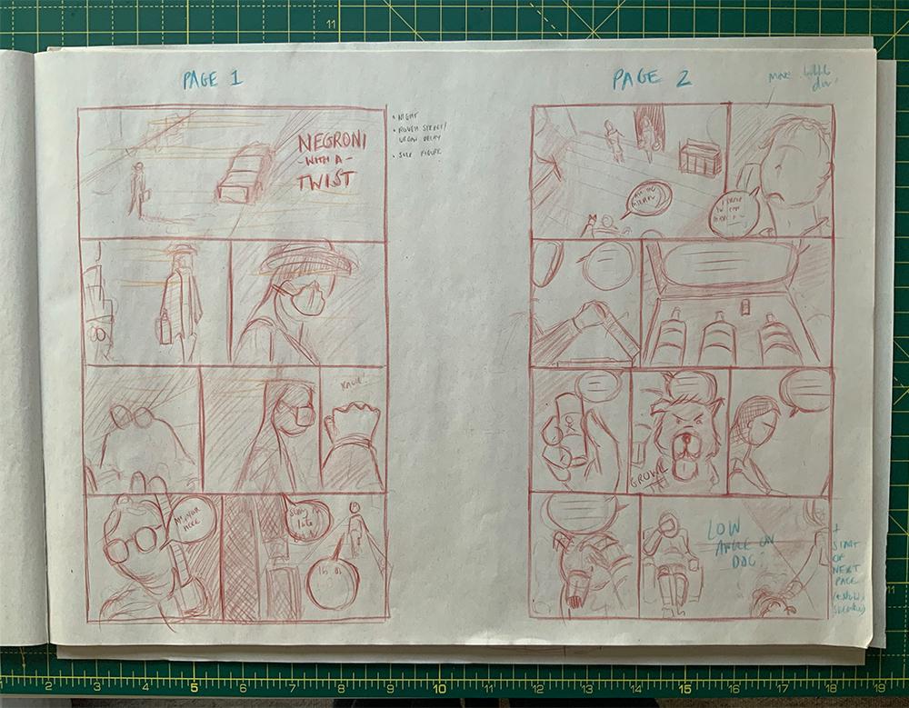
Refined layouts for pages 1 and 2
Something which both film and comics have in common is the ability to deliver two ‘tracks’ of information at the same time. This comes more naturally to me on paper than on screen, for some reason.
Because there was so much information to deliver in a short space, a panel of dialogue illustrated simply by the speaker talking, felt like wasted paper. Instead, showing a close-up of something else delivers new information alongside the speech bubble.
This is one of my favourite things about telling visual stories!
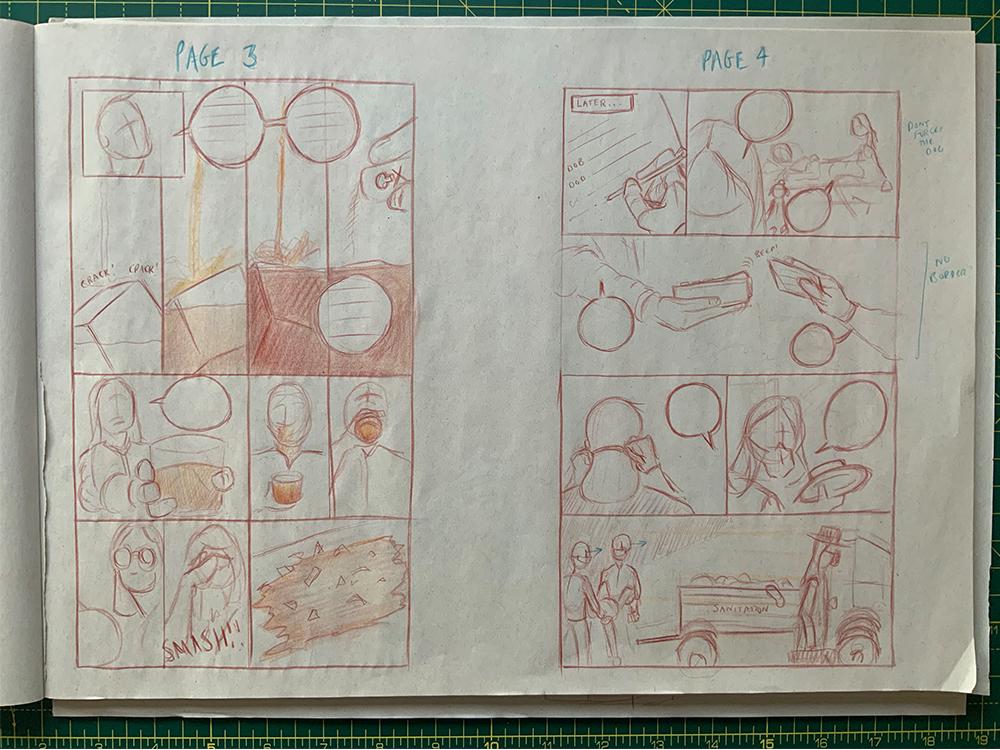
Refined layouts for pages 3 and 4
The one place I broke the four-row rule is on page three (above) where I used two rows to show action-to-action panels of the drink being made. This took several attempts to get right, but as the story is about a negroni, its preparation warranted special attention.
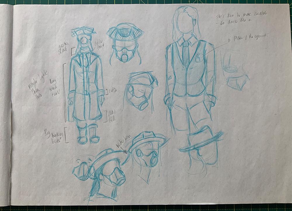
Character sketches
I spent some (but not much) time sketching out the mysterious mixologist. Originally they were a man with long hair (like the forensic cleaner the story was inspired by), but eventually became non-binary with short hair. With no faces drawn, they could be either a man or a woman, it’s up to you.
Pencils
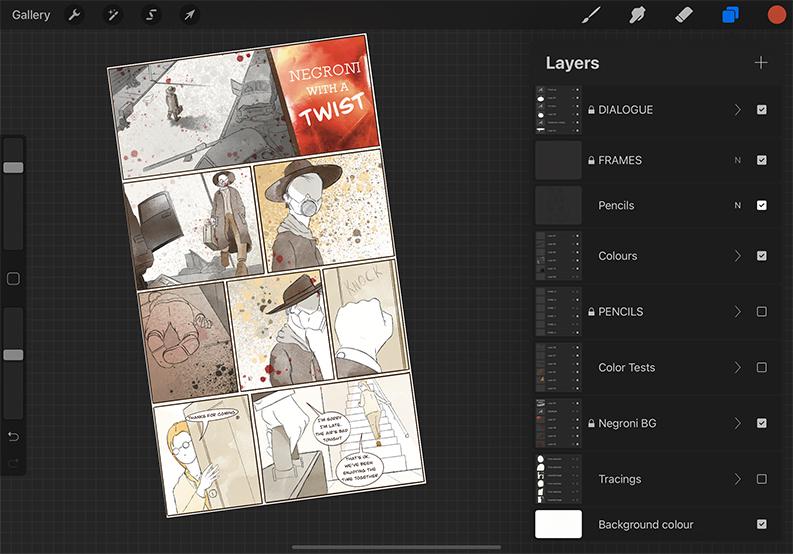
I knew I was going to have to finish the comic in Procreate, if only because I could experiment with colours without ruining the original artwork. But I didn’t want to make the whole thing digitally — I spend enough hours staring at a screen already, and I really enjoy the feel of drawing on paper.
So my compromise was to draw my panels straight into my sketchbook and scan them into Procreate.
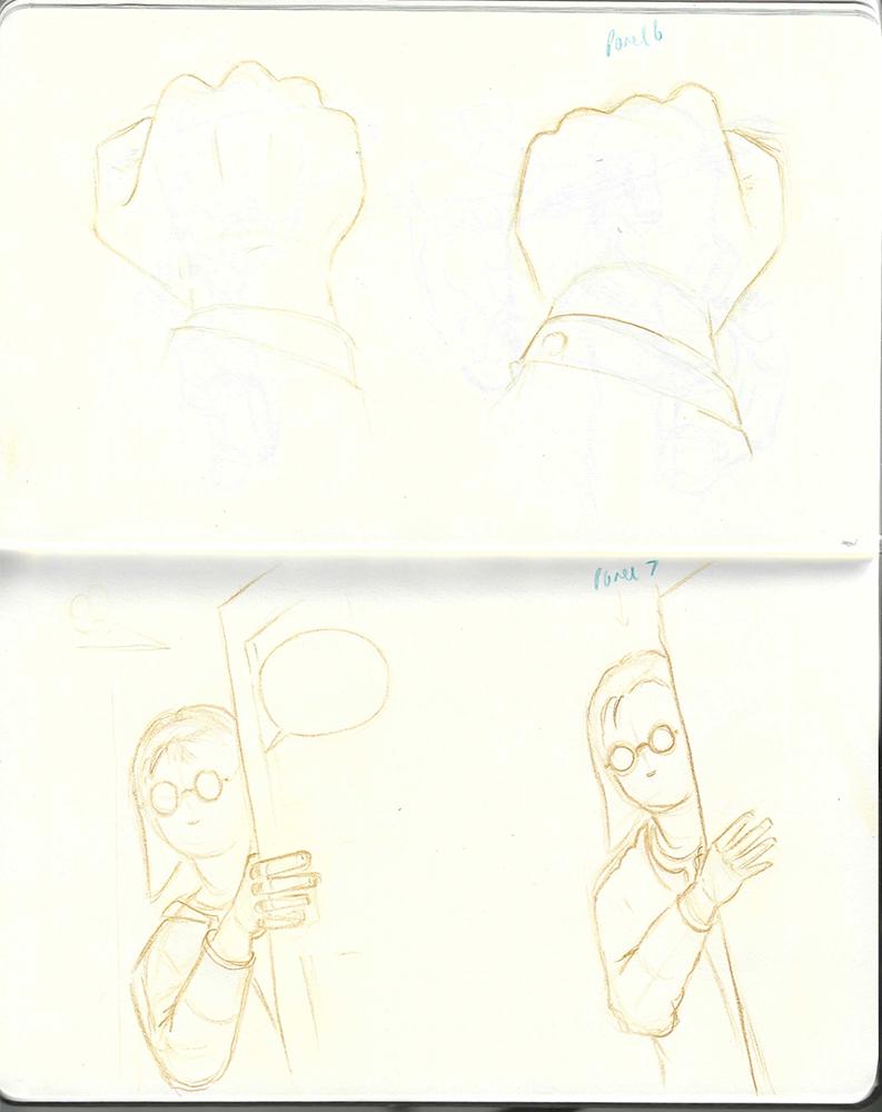
A scan directly from my sketchbook which I imported into Procreate
This had many benefits.
Firstly, I could draw my images much larger than the final comic dimensions would allow. The waxy Polychromos pencils I love drawing with work best drawing large.
Secondly, I could try different compositions and redraw panels until I was happy with them.
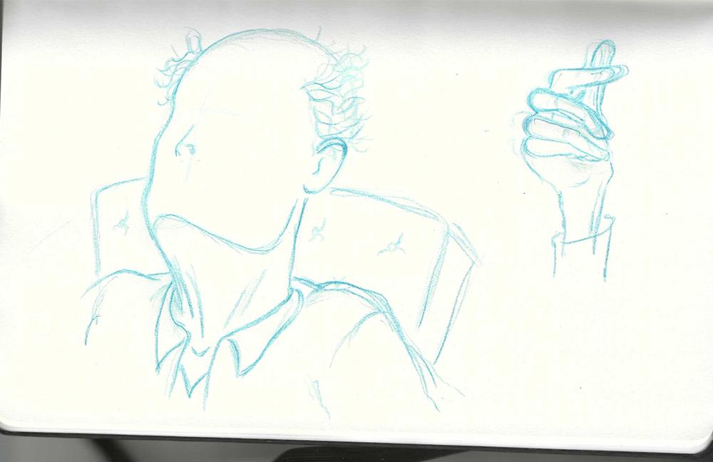
I drew the old man’s upper torso and then tried different hand designs
And thirdly, I could separate parts of the drawing and then collage them together in Procreate. The old man’s hand, for example, took multiple attempts, but his head and shoulders I got right first time.
As I wrote back in April (#067), drawing multiple passes of an image helps me first discover it and then refine it.
This sketch-and-scan process allowed me to explore an image before committing to any composition.
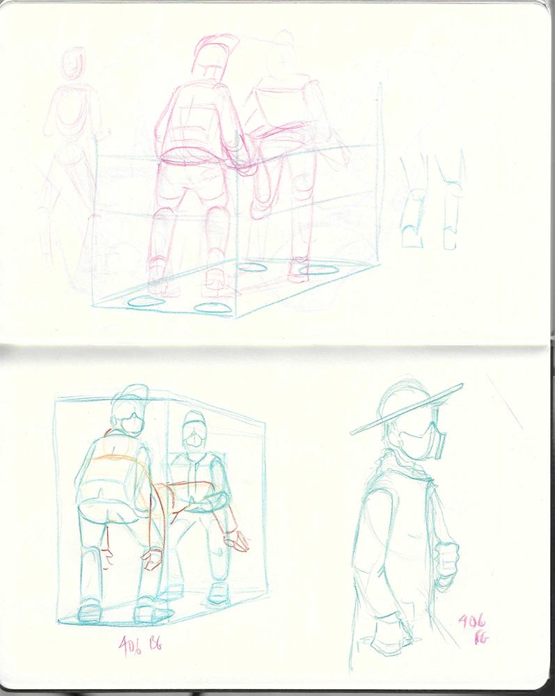
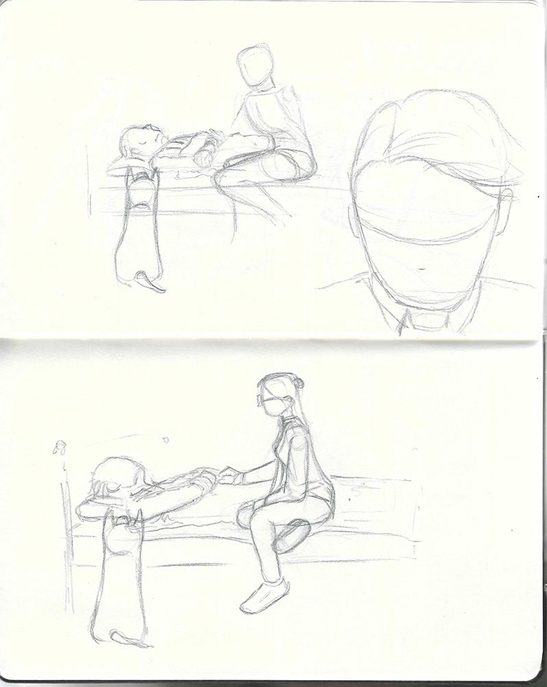
The perspective on the final panel took several attempts.
I’ve uploaded a 30-second timelapse of one of the pages - you can see the process I’ve described above at lightning speed.
Digital
Once in Procreate, I had a lot of flexibility with composition.
I traced over my sketches using a brush called ‘Peppermint’, which mimicked my pencils. I knew from the beginning that I wanted the comic to look pencil-drawn, with sketchy outlines and construction lines still visible.
Colouring the comic was a complete crapshoot. I almost didn’t do it at all. In the end I painted with a brush called ‘Blotchy’ which added a watercolour texture and allowed me to easily build layers of colours to indicate depth and shadow. I used some airbrushing textures to create the polluted air and add texture to the background of some panels.
To paint the negroni, I built up layers of red, orange and yellow colours using the ‘Gauche’ brush and then smudged them together until they looked right.
The more recent updates to Procreate have made it a formidable alternative to the software used by professional comics artists, it’s worth giving a try!
Review
Here are my original layouts against some test prints of the final comic (before colouring).
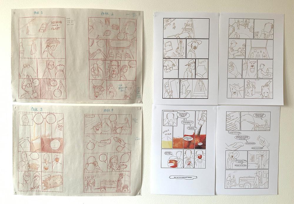
One thing I notice is how similar the finished layout is to the originals.
The only panels that changed significantly is the row at the bottom of page three, where the old man dies. Originally we were to see it in a sequence of three shots, showing the woman’s perspective and then the spilled negroni on the floor. But as I came to draw it for real, it felt too ‘on the nose’.
This had me stuck for a few days but the solution I came up with — a single, borderless panel with a floating speech bubble in the middle — although not that brilliant, is a little less clichéd and at least uses a technique that is unique to the comic. It creates a bigger gap for the reader and lets them imagine the death in their minds rather than seeing it on the page.
I made two small changes after showing the pencils to friends (thanks Marc and Caro!). Marc suggested replacing a skull and crossbones on the poison bottle with a more subtle label. This minor alteration added more ambiguity in a key moment that I think keeps readers guessing for a few more panels. Caro changed a line of dialogue on page one: the woman originally said “ah you’re here” when the mixologist arrived; now she says “thanks for coming.” Although they both suggest the woman is anticipating the guest, the altered version tells us more about how she feels about it.
I’m really struck by how these tiny edits can really change how the audience respond to a story!
Until another Sunday soon,
