This letter was originally written for readers of my pop-up newsletter back in June. It turned out to be an in-depth exploration of the choices that visual storytellers make in constructing narratives — and I think it deserves a wider audience!
👇
When you tell a story visually, there are lots of choices to be made.
What moments are you going to show? How will you frame those moments? How many panels will fit on a page (or in a scene) and what is their best layout? What is the most effective composition of each shot or panel? What words are best to go alongside the pictures? How will you ensure clarity and flow?
That’s…a lot.
I always feel overwhelmed at the start of the story process in either video or comics.
In drawing a new short story for my forthcoming zine, I’ve found a way to avoid that overwhelm: breaking the process down, to answer only one of these questions at a time.
It’s sequential art, so why not make it sequentially?
It’s turned out to be a pretty effective process (for me) - but before I talk you through it, a few words on the story.
The Story
The story I am drawing will be called Aquanimity.
We know it’s about a man who learns a lesson about equanimity while swimming. The principles of storytelling dictate a couple of things: firstly, that in order for this to be a journey, he must start at the opposite end of the spectrum - the opposite of equanimity, which is stress and anxiety.
Secondly, that if this is to be a short story then, as George Saunders lays out so well in A Swim In The Pond In The Rain, something profound must change for the character. Nothing is the same again.
Robert McKee in his book Story also talks about the ‘extreme of the extreme’, pushing the two ends of the spectrum further apart. So, my character is not just anxious and stressed at the start of the story, he thinks he is not. He is in denial.
As the story opens, the swimmer will state his belief that swimming brings him calm. Then a series of three encounters in the water (always three!) will make him increasingly stressed and angry until…he has a heart attack! As he sinks to the bottom of the pool, expunging his last breath, he learns what equanimity really is.
Good or bad, that’s the story.
1. Choice of Moment
In Making Comics, Scott McCloud says the first decision for a visual storyteller is choice of moment - how will the action break down into images?
Ideally, each single image moves the story forward.
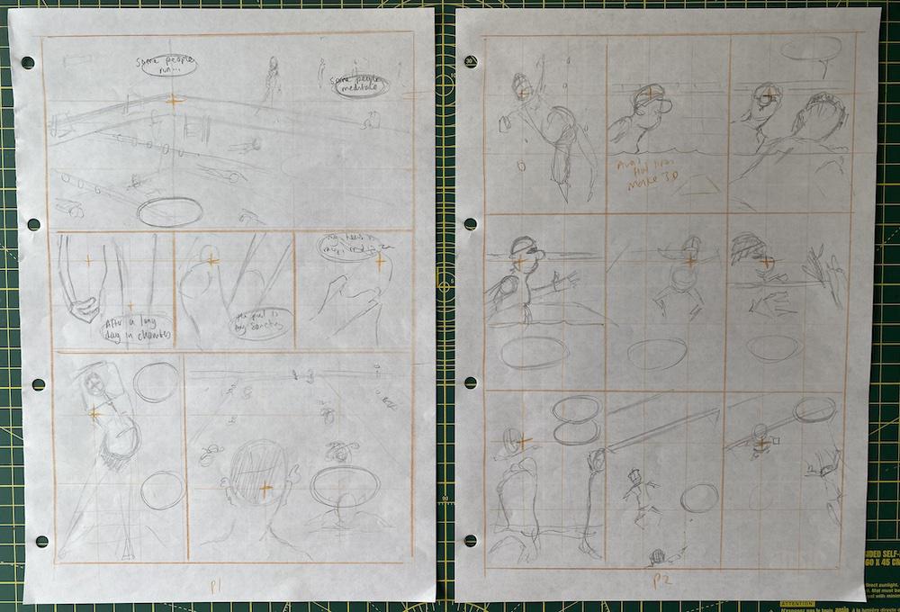
To focus my mind on this choice and nothing else, I stripped all other information out. I filled two A3 pages with dozens of equal-sized square boxes. The shape of the panels and their size don’t matter right now; the only thing that matters is what moments are within them.
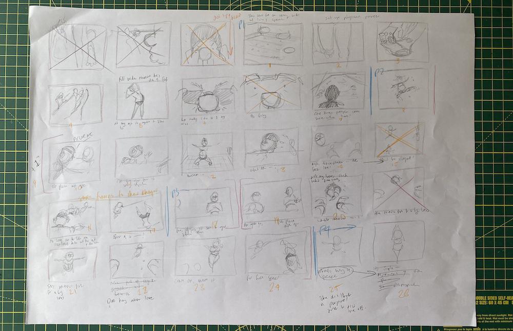
A page of square boxes filled with what I guess you could call storyboards.
I mostly did this by gut instinct, working fast, asking myself “what do I want to see next?” and seeing how far that took me. It’s important to finish the story in a single sitting.
The next day1, I analysed what I had drawn. Was every panel essential? Did it move the story forward? This is where I really break the story down into actions and figure out what panels best visualise that action.
A good rule of thumb: if in doubt, choose the sequence which tells the story in the fewest shots.
I know it’s not easy to read my scribblings, but at the top of the first page (above) I opened the story with a few panels of the swimmer arriving at the pool, putting on his goggles and hat. But I cut them out - they didn’t serve a purpose that wasn’t done equally well by the moments that followed.
Similarly, the first two panels of the third row (above) show a moment where the swimmer is about to push away, but is interrupted by another swimmer. Here I realised that I needed to insert an extra panel at the start of this moment, showing our swimmer alone in the water before he is interrupted.2
This, right here, is the work of sequential art!
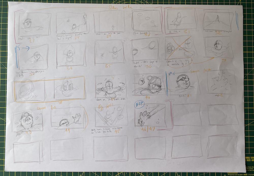
Simple thumbnails like this are great because they strip out all the decisions that aren’t necessary yet. Once I was happy with my choices, I roughly broke the panels down into pages (the blue pencil marks, above).
2. Choice of frame and flow
Knowing what my moments were, I was now able to figure out how to arrange them on the page.
I’d hoped this would be a four-page story, but the number of panels was telling me it would be more like six or even seven.
I got more sheets of A3 paper and drew two page outlines on each sheet. I used the three-act structure to roughly help spread the panels over pages:
- Page 1: introduce the character and their desire for equanimity
- Page 2: the first obstacle - a slow swimmer
- Page 3: the second obstacle - a swimmer who gets in his way
- Pages 4 & 5: the third obstacle - he races a swimmer who is too fast
- Page 6: the climax - his heart attack.
In this way, each page is its own unit of the story - the equivalent of a scene in a movie - it’s own little mini-story.
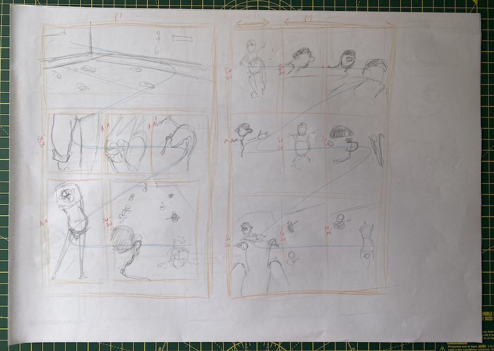
Pages 1 & 2 sketched out onto A3 paper. There are some familiar elements of visual storytelling here: the 'opening wide shot' to introduce the location, and the sequence of close-ups building to a reveal of a character.
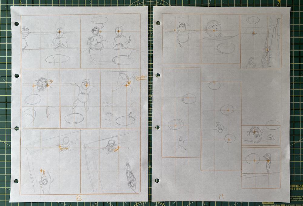
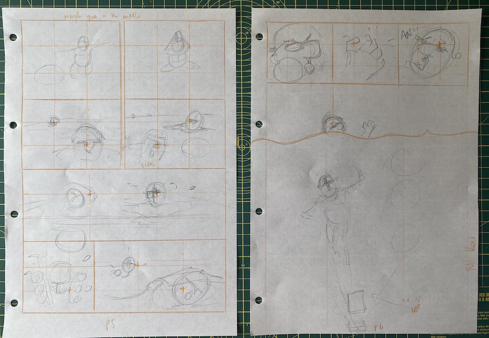
Each page had roughly seven panels on it, spread across three rows. The exceptions are page 2, which needs nine panels, and page 5 which has panels across four rows to increase the sense of tension as the two swimmers race.
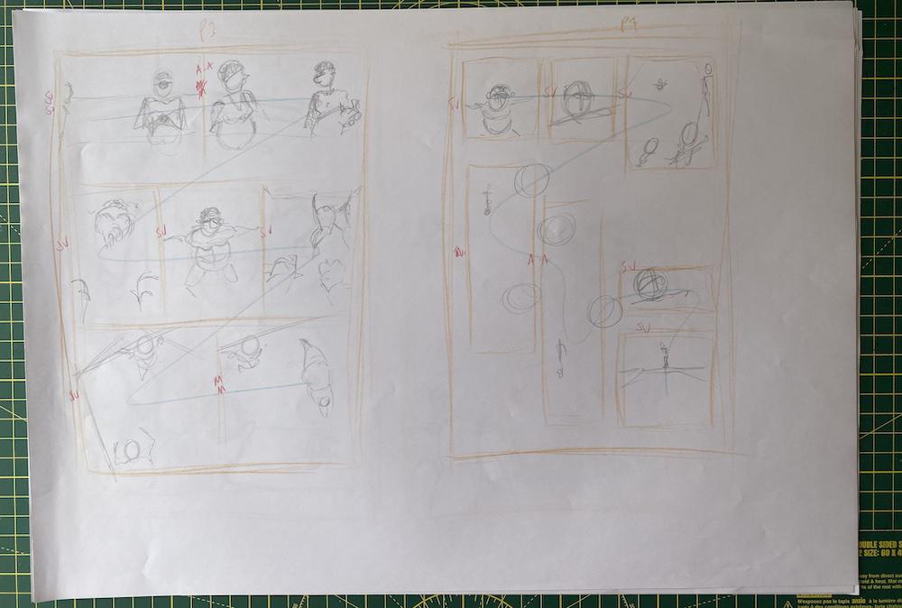
Pages 3 & 4 on A3. I'm working fast and being sloppy. Page 4 includes a brief interlude where our swimmer has the lane to himself. I drew two long thin panels to mirror the swimming pool lane as seen from above.
Separating the choice of frame from the choice of moment meant that I could focus on this job alone. It freed my mind up to imagine some more creative page layouts.
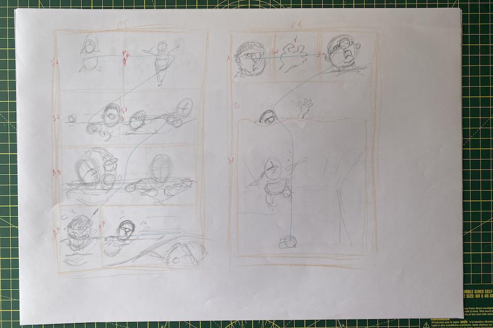
Pages 5 & 6. And Page 6, where our swimmer sinks to his possible death, is a big hero panel. The top border of the panel will be the surface of the water which we see our guy sink into.
Finally, with this work done, I took a moment to imagine the flow of each page. I drew lines (you can see them faintly in blue above) imagining the path the reader’s eye should take to be pulled through the story. As I refine the pages I will use this information to make sure that the pages scan naturally and the reader does not have to think about what to look at next.
3. Choice of composition
I know what the panels are and how they will fit on the page. Finally, I want to figure out how the content of each panel will be arranged.
This time I got six sheets of cheap A4 and quickly drew the panel borders on each one.
I broke each panel down into thirds and used this to guide my composition. The centre of attention for each panel lies along one of the intersections, hopefully making the panel feel balanced but visually stimulating.
I’m also trying to figure out where the thought balloons will go. I can tell at the moment they are too small, so that might cause headaches in the pencilling stage. But for now it’s enough.
So there we are! A week’s work and I have a clear idea of how this comic is going to look. That means that as I sit down to beginning pencilling, I won’t need to worry about my choices of moment, frame or composition. I can just focus on drawing a good picture!
Subscribers to the pop-up newsletter have already seen the finished story — the rest of you will have to wait until it’s published in October!
I hope you found this useful in your own visual storytelling practice.
I don’t share any of this as an expert. I never went to art school nor (as you know) am I an expert in comic art. I am really learning this as I go along!
Pro-tip: separate the creative part of the process from the analysis part, by at least one day. They use different parts of your brain and it’s hard to flip-flop between them. Create. Pause. Analyse. ↩︎
An interruption is always an interruption from something, so you need to show what that something is, and then show the interruption! ↩︎
Until another Sunday soon,
