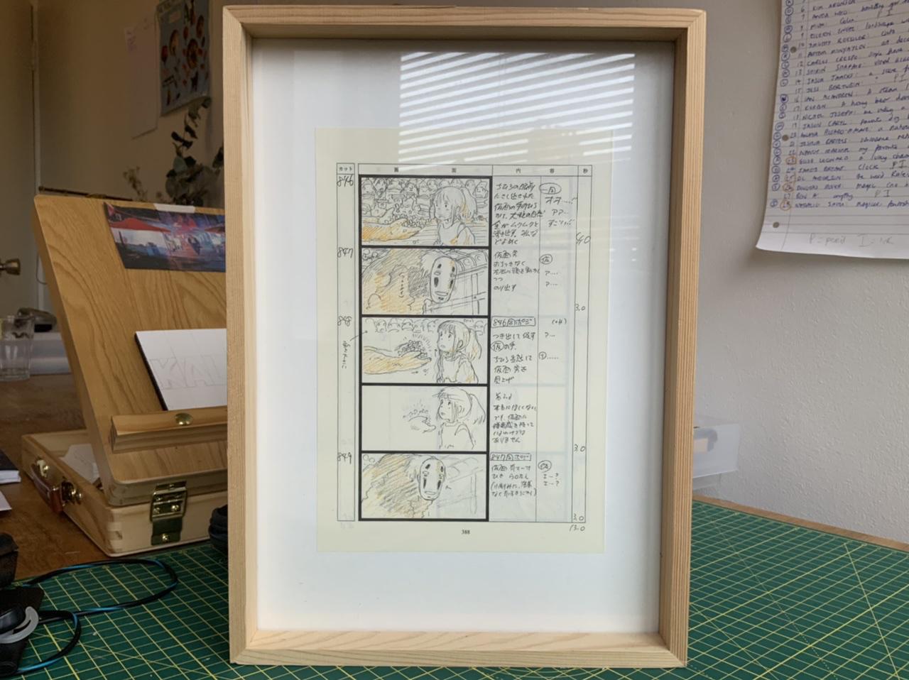
On my desk is a framed page of storyboards from Miyazaki’s Spirited Away.
Spin the frame around and on the other side is a print from Scott McCloud’s graphic novel The Sculptor.
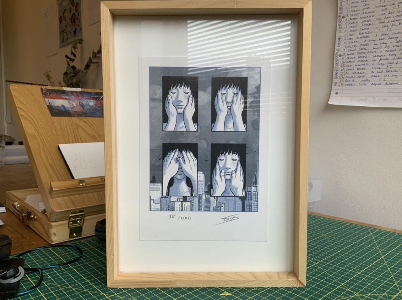
They’re in the same frame to remind me that film and comics share a common ancestor (#003).
This discovery expanded my appreciation of both art forms (well, began my appreciation of comics entirely!) and thinking of myself as a Sequential Artist helps me really understand the clay that I’m moulding as filmmaker.
The film and the graphic novel are related like a pop song to a poem and, just like reading or writing poetry can make your songwriting better, I think filmmakers benefit from indulging in graphic novels.
I love seeing how a good graphic novelist approaches a scene because it is almost guaranteed to be different to a director while still using the same clay: a sequence of images with (or sometimes without) words.
I want to see - and make! - films with a graphic novelist’s eye!
In particular, I think graphic novelists have a more interesting understanding of the relationship between words and pictures.
The dynamic between these two halves of visual storytelling fascinate me. Back in journalism school I was trained in an arcane craft called “writing to picture” and I learned that the ways words and images can be combined can create poetry - even in journalism.
Remind me to tell you about that one day.
It’s hard to articulate how words and pictures work together so let me use an example: Jason Lute’s epic graphic novel Berlin, which I just finished reading.
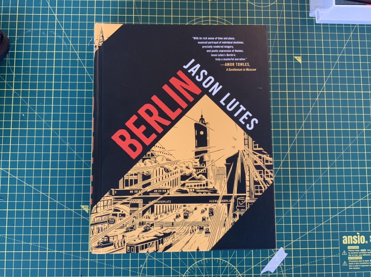
I use the word epic pointedly: the novel is 500 pages long, spanning four years of history with a cast of 40 characters. It is a lush and vivid portrait of Berlin in the final years of the Weimar Republic, a time of extreme inequality, political polarisation breaking out into street violence, dizzying technological progress and nihilistic decadence…sound familiar?
Jason spent an epic 26 years (!!) completing Berlin and someone had better have paid a lot of money for the screen rights already. This book is crying out to be an HBO miniseries.
There’s a three-page scene that I think is sophisticated visual storytelling, especially in regards to the dance of words and picture. I scanned, printed and stuck the pages in my sketchbook before scribbling notes all over.
A journalist, Kurt Severing, is struggling to find purpose in his work as fascism takes root around him.
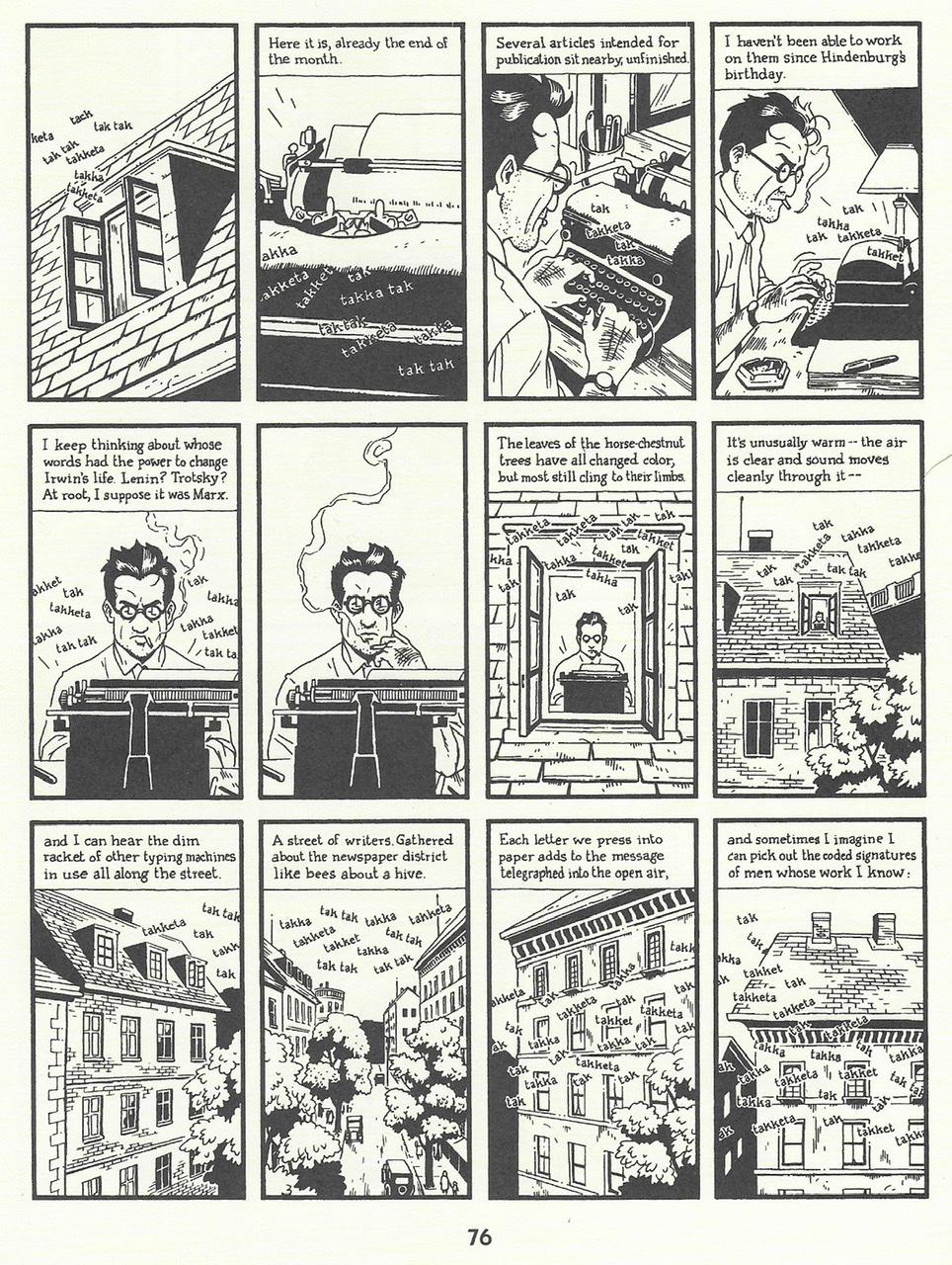
First of all, nothing actually happens in this scene: there is no action, just reflection and thought.
This is an interesting distinction between film and comic. Films, we are so often told, are about action, they are stories about things people do not things people think about.
The filmmaker must convert inner thoughts into external actions or forget it.
The graphic novel, meanwhile, literally has the word ‘novel’ in it - it’s able to devote pages to inner monologue and still make it visual!
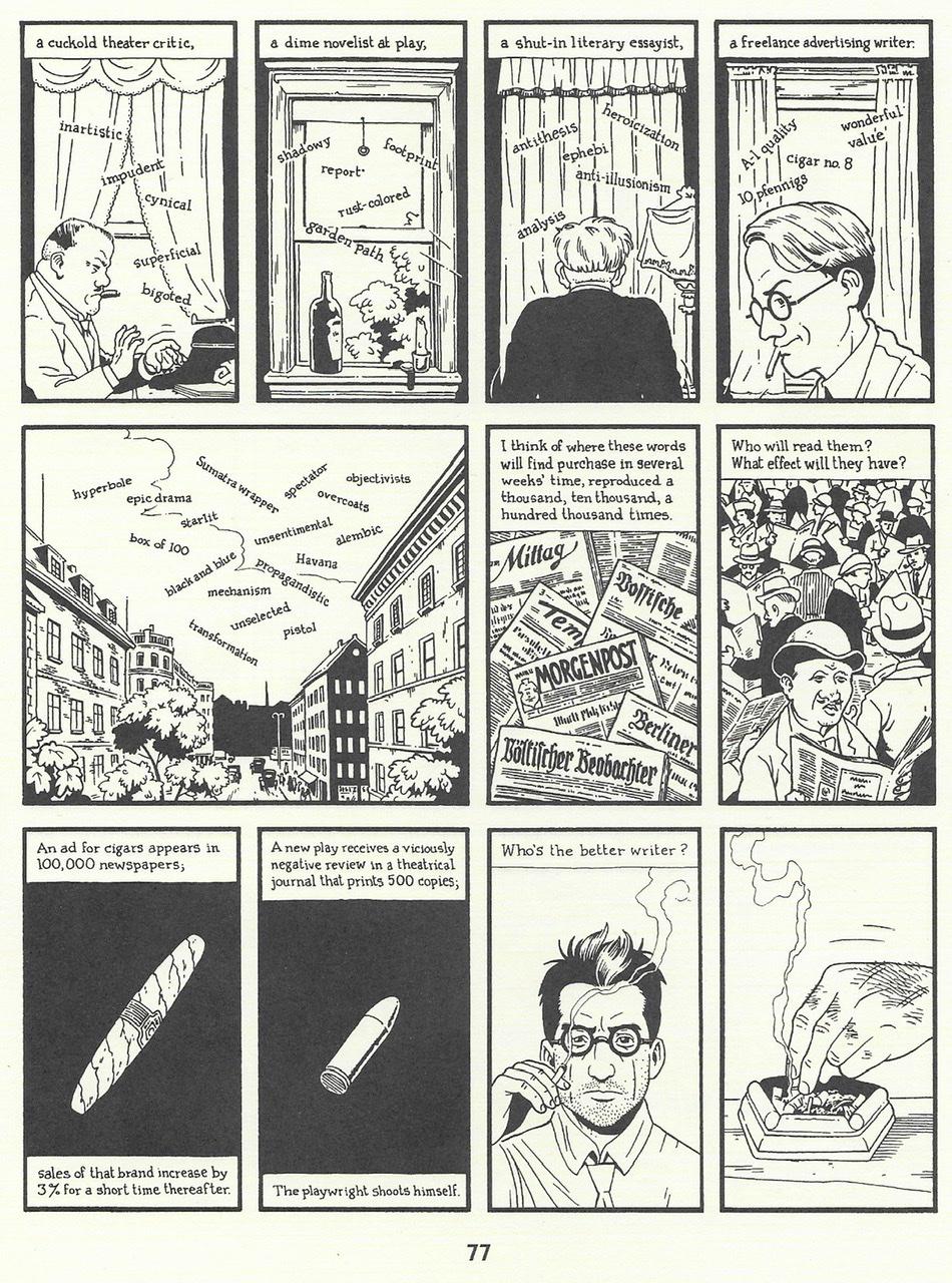
If we were to put this scene on screen, we’d use typewriter sound effects rather than the “tak-tak” Lutes writes in his panels.
But to do that, we lose the wonderful descriptive words that float up from the typewriters in the first five panels of page 77. This is a treatment that would never occur to a film director because they’re not thinking of visualising the sound effects!
I really love the match cut between the cigar and the bullet, above.
An idea like this is translatable to the screen, but a modern director would most-likely favour a realistic treatment over something symbolic, maybe feeling an effect that requires the audience to consciously acknowledge a juxtaposition would pull them out of the photo-realism of the scene.
The same goes for the first panel below - an almost magic-realist vision of the newspapers reaching into the sky.
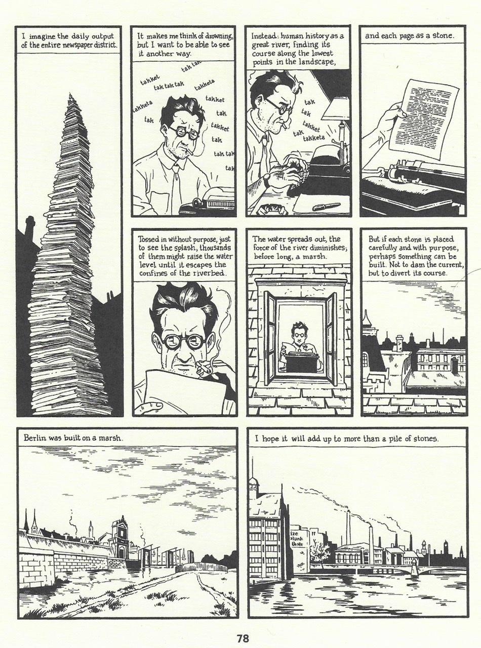
But back to words and pictures.
In this scene, I’m struck most by two things: how descriptive the narration is and how the images are often showing something unrelated.
Scroll back up to the seventh panel on page 76. Kurt is typing “The leaves of the horse-chestnut tree have all changed colour but most still cling to their limbs.” Lutes chooses not to show us the leaves of the horse-chestnut tree, instead beginning a multi-panel zoom-out from Kurt’s apartment to the street.
You have words and pictures delivering information on two separate channels. There is no redundancy. Like a musical counterpoint, the words and pictures are gently pulling against each other and in doing so creating an extra energy.
I’d love to see a film made like this, but I acknowledge there’s a big hurdle. In a comic you can read the page twice, or at least slowly. The challenge for a filmmaker is making sure the viewer is not overwhelmed with information, without slowing the film down to molasses.
I’m not saying graphic novels are better than film and, in fairness, many other scenes in Berlin are clearly influenced by cinematic staging and editing.
But I’m fascinated by the way these two mediums - these two accents speaking the same language - can intersect!
Until another Sunday soon,
