This week’s letter is a smorgasbord of different things - if one topic doesn’t interest you, I hope another will!
First up, questions
I thought it would be fun to do a Q&A in next week’s letter. So many of you enjoyed my answer to Brendan’s question in letter #17 so why not try it on a bigger scale?
I’ll answer any question you have but maybe you’d like to ask me something about my creative process, visual storytelling, video production, screenwriting, editing, a video I’ve made, maybe even writing a newsletter…I’ll share whatever expertise I can in response.
To take part just hit reply to this email with your question before next Sunday. If I receive more than five I’ll turn next week’s letter into a Q&A.
Second, videos
As I promised last week, some new films I produced have been released this week.
On Monday, The New York Times published this film with the former UN Human Rights Commissioner (and Crown Prince of Jordan) Zeid Ra’ad al-Hussein.
He makes a bold and urgent argument: world leaders have given up fighting for human rights, and atrocities are now allowed to happen with impunity.
I really wanted people to feel angry when they watched the video - if I could just create a dose of that sense of injustice, I hope it is worth it.
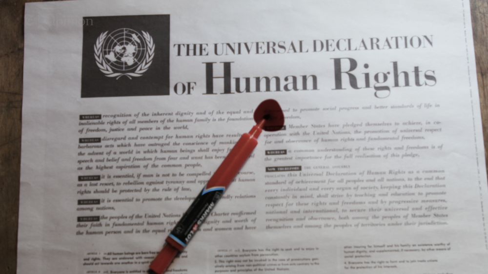
I designed a bunch of visual devices to try and make that happen cinematically: I used the Universal Declaration of Human Rights as a frame and juxtaposed images of human rights violations against the optimism within the text. Juxtaposition is the most simple of filmic devices but it’s ever powerful because by cutting these things side-by-side you effectively create a new space (📣 Third Something klaxon!) where they exist together.
A big challenge was to convey the lack of response from world leaders in a visual way. It’s difficult because you have to show an absence: how do you show people not doing something? My not-so-subtle solution was to scour footage from press conferences, waiting for moments where presidents and prime ministers were being asked a question. Removed from their context, they appear to be staring vacantly, hopelessly into space and - in montage - conveys a sense of complete idleness.
Zeid himself suggested the idea of circling stories of human rights violations in newspapers and it came out great. It allowed me to have a scene with energy, which is usually missing from these earnest stories. Plus it created the opportunity for this final shot. Heavy-handed? Maybe, but makes for a memorable symbolic connection, and pays off the idea set up at the beginning.

Then on Thursday we made news publishing this strong opinion from Facebook co-founder Chris Hughes.
This film was a logistical challenge more than any other - we only had about ten days to turn it around. That’s ten days to boil Chris’ original 5,000 word essay into a workable script, shoot and edit him and commission an animator to create more than a dozen animations.

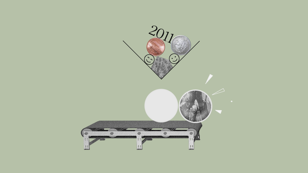
We tapped up Tom McCarten, a New Zealand-born animator who created some of the distinct graphics for Operation Infektion. He was a great choice - he has witty ideas but he also works fast. While most of the animation is illustrative (in other words, it repeats what the words are saying) there are one or two clever visual devices - this conveyor belt for example:

It’s not a perfect video, as we had to make a bunch of compromises, but we decided it was more important that the video existed than it was a flawless piece of filmmaking.
Sometimes that’s the right call.
Thirdly, comics
Way back in #04 you piled in with recommendations for great graphic novels. I have been slowly working my way through them. Here’s what I’ve read so far:
Sabrina by Nick Drsano: I put it down just a few days ago. It feels like the inverse to Square Eyes: where that had intricately rendered images illustrating a thin story, Sabrina is a dense, rich story…illustrated like an airplane safety manual. The simplicity of the illustration really helps create atmosphere - the world in feels very real. The story left me a bit emotionless but as a portrait of people and place it’s quite superb.
Killing and Dying by Adrian Tomine: a compilation of short stories, I enjoyed how Tomine masters a different style for each. A couple of the stories capture American suburbia stunningly well. Go Owls and Killing and Dying in particular are heartbreaking reads that succeed in sketching out fully real characters in a brief number of pages. Really great.
Asterios Polyp by David Machuzzelli: I didn’t like the rendering of this one - the line work and colours weren’t to my taste, but the visual storytelling is marvellous. Like Nick Sousanis’ Unflattening, it creates abstract and surreal compositions that require more than one reading to understand. I love it when an artist breaks away from literal representation of a scene and manages to find a more sophisticated interplay between words and pictures (man, if I could achieve that in one video!) Unlike the other two, this story feels like it’s pushing the graphic novel form to new places.
Fourthly, poetry
Even more way back, in #03, I wondered if there might be a visual haiku form out there to explore. I must admit I haven’t given it the focus I wanted to but I discovered someone has been thinking about it very hard - the comics theorist Neil Cohn, whose book I wrote about more in #13 (phewf, so many previous letter references!)
Neil codifies comic panels by the number of “entities” - think characters - they contain and constructs a scale, where at one end there are “polymorphic panels” which contain the same character multiple times in the same frame; and at the other end “amorphic panels” that contain no characters. It’s analogous to the scale between a wide shot and a close up.
With this scale established, Neil suggests a form of poetry that uses the scale as a rule: a series of panels which start polymorphic and develop to amorphic. He calls this form of poetry a Reducto because the amount of information each panel contains reduces as you go through the poem.
That’s pretty cool right? Just like a poem, it forces a tight structure on the artwork - constraints which breed creativity. I strikes me as a simple and contained exercise that could help a filmmaker or comic artist practice their visual storytelling.
What if you challenged yourself to tell a story in five shots, each one a tighter shot than the last? Or visa versa?
Fifthly, are you new here?
If so, welcome! A half dozen newcomers arrive every week or so and I’ve been meaning to give you all a proper welcome. I hope you find The Third Something interesting.
If there’s someone in your life who you think would get a kick out of these letters please forward this email on. You can also support me with a cheeky one-off donation. Thank you to everyone who has tipped me in the last couple of weeks, I’m honestly so touched.
That’s it! I’m looking forward to reading all your questions!
Until another Sunday soon,
