Through the synchronicity that only the universe understands, as I was writing to you about ideas last Sunday (#69), Elizabeth Gilbert was talking about the exact same thing on Russell Brand’s podcast.
If you liked the gist of last week’s letter and want to dig deeper, give it a listen.
This week’s letter is a continuation to the ideas in (#55): sequential art in film and graphic novels.
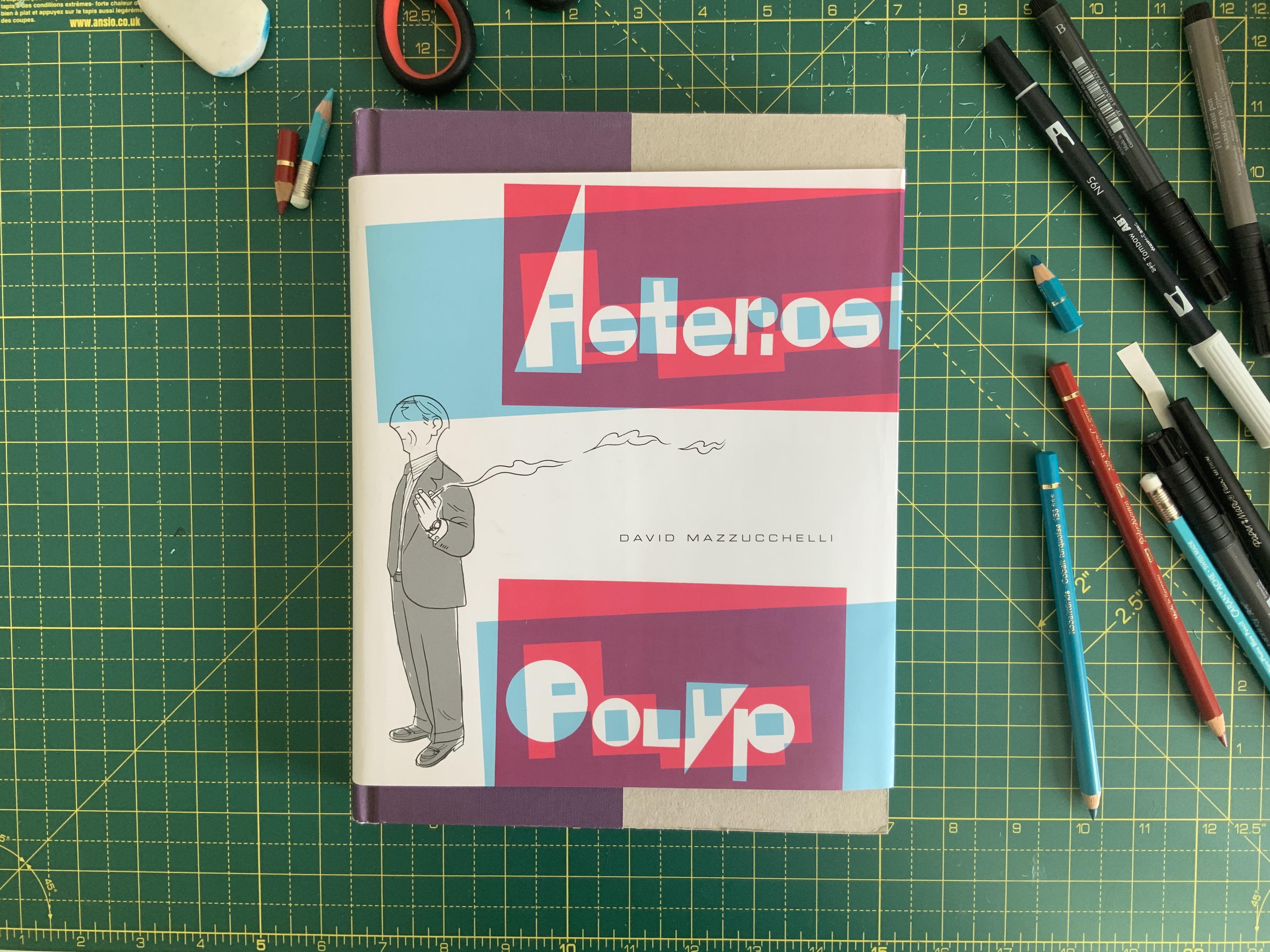
Last year, long-time Third Something reader and cartoonist Hugo recommended I read the graphic novel Asterios Polyp by David Mazzucchelli.
I read a library copy in one afternoon and must admit I struggled to get into it. But in the midst of quarantine I have given it another go.

Yes, the sleeve does not fit the book - that is apparently on purpose, part of Mazzucchelli’s message about form and function.
It’s actually very good and, if you’re a fan of graphic novels or you work in telling visual stories, I recommend finding a copy.
In short, it tells the story of a middle-aged architecture professor who goes through a crisis and ends working as a mechanic. It’s narrated by his dead twin brother.
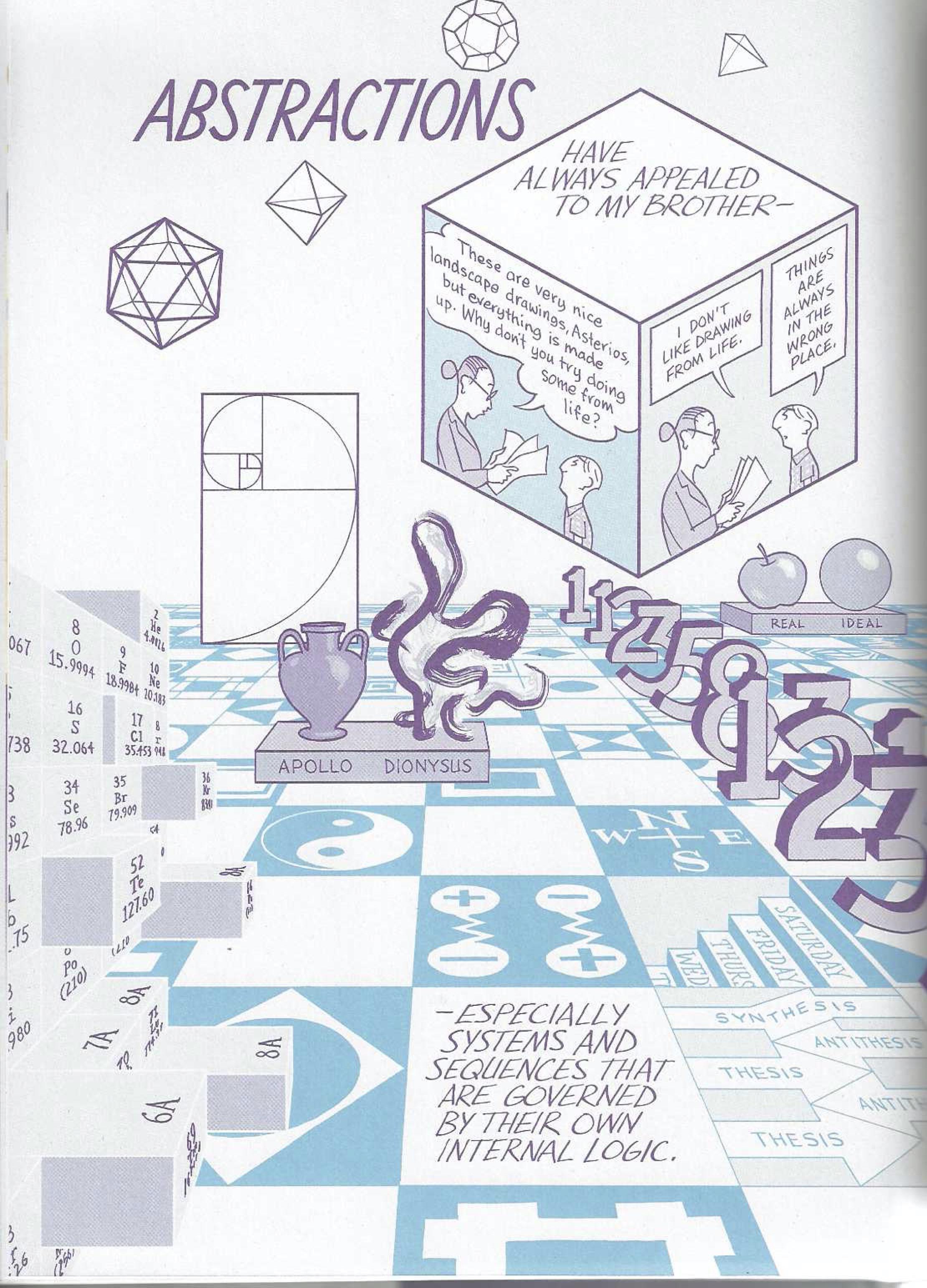
While most of the story is told in narrative sequence, where each panel shows action that moves the story forward, Asterios Polyp occasionally breaks away into wonderful full-page abstractions like this one (literally titled so):

What excites me about pages like this is that they are unique to this kind of visual storytelling.
Have you seen a movie or documentary that suddenly leaves the ‘real’ world like this? With today’s VFX technology it’s entirely possible and cheap, but it rarely happens 1
Film is so tied to naturalism - that is, to be a photorealistic portrayal of people and places - that abstract treatments aren’t valued.
But comic artists, like the surrealists and expressionists before them, know they cannot compete with the film and discover that moving in the opposite direction is bountiful.
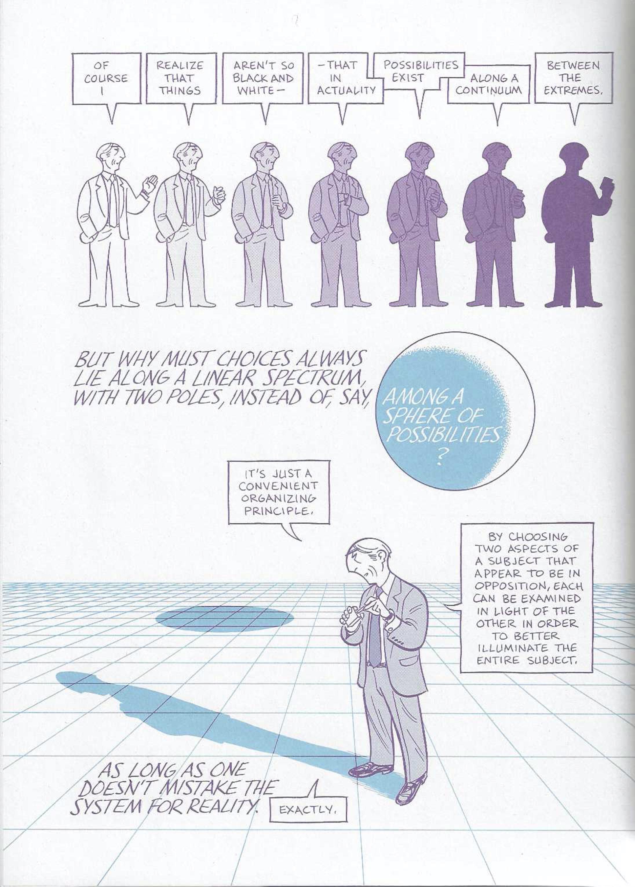
Something else I love: Mazzucchelli uses this abstract breakout device to explore and explain theoretical concepts through dialogue.
In this page, the idea of duality is explored through a conversation between Asterios and the narrator.

I think dialogue is a really effective way of explaining ideas. Two sides of an argument can be presented, or the idea itself simply challenged in a natural way.
Pages like this remind me of Nick Sousanis’ graphic essay Unflattening, a PhD thesis entirely in sequential art.
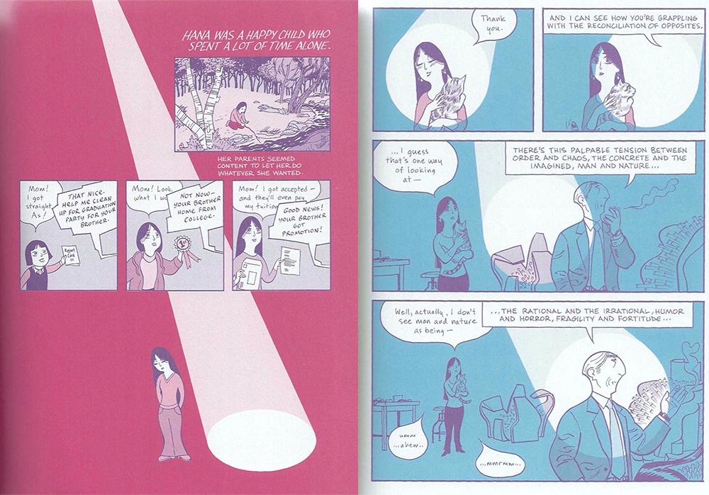
Finally, here’s a simpler device, which I found really effective:

A character’s internal experience of the world rendered into something we can see: the invisible made visible.
That’s good visual storytelling. It’s exciting how much you can learn about one art form by studying another.
Adam McKay’s films Vice and The Big Short are the only examples I can think of that sort-of do this - more examples welcome! ↩︎
Until another Sunday soon,
